📈 Visualizing Retention
Nov 18, 2020 • 5 min • Growth
In my last post, we went over how to choose a retention metric for your product. Once you have a metric locked for measuring retention, the next step is visualization. At the end of the day, visualizing retention is just a tool, but it's a useful one for making decisions and performing analysis. Let's get into it.
N-Day vs. Unbounded
Before we go further, you need to decide how you are going to use your metric. If you aren't familiar with N-day vs. unbounded retention then no worries, Mixpanel has a solid explanation:
Unbounded retention captures the users who come back on a specific time unit (e.g. 1 month) or afterward. Whereas, N-day retention looks at only the users who come back on that specific time unit.
I find that it's easier to visualize this sort of things. Take three users that visit your product on different days. How would their results differ for each method?
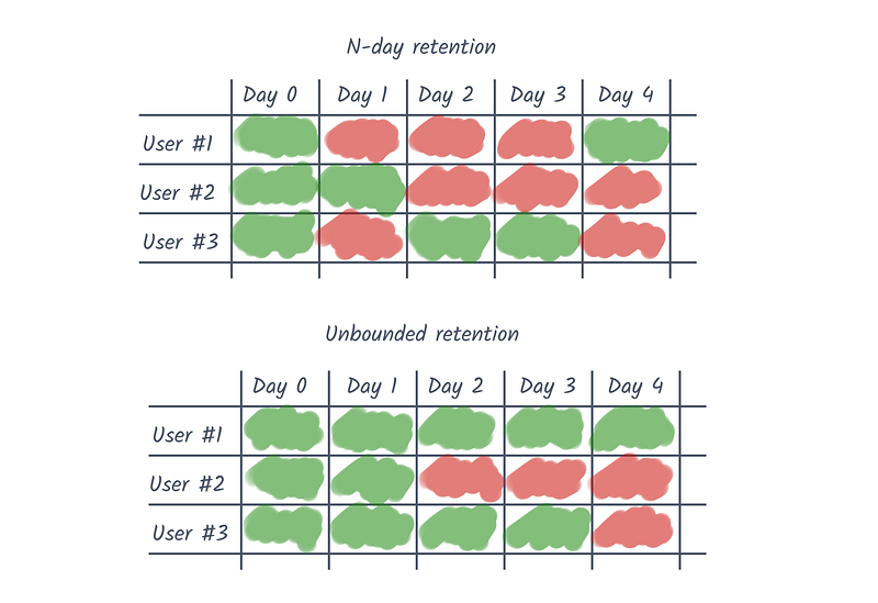
So, which approach is best for you? If your users don't use your product at a regular cadence (e.g. eCommerce) then unbounded is a fair choice. Otherwise, if your users return on a daily, weekly, or monthly basis, which is the case for most of you reading this, then you should default to N-day retention.
How to Visualize Retention
There are several approaches to visualizing retention, but I'll focus on the two most popular: Spreadsheets and retention curves.
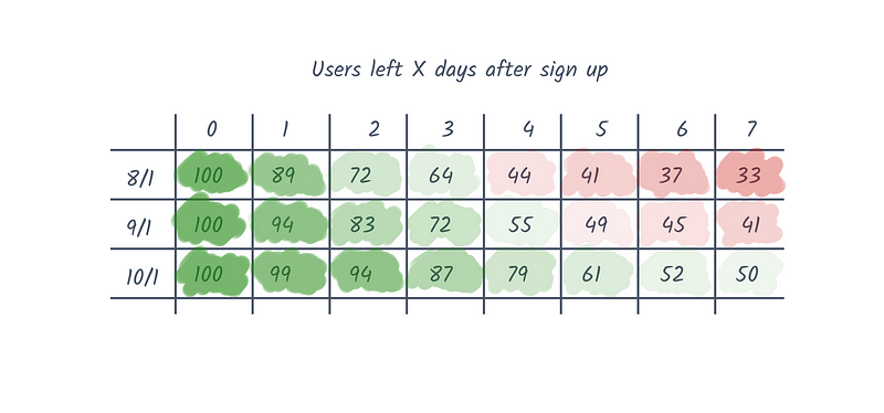
As you can see, there are columns for each group of users created over the same time period (also known as a cohort) and then rows that describe what percentage of the group were still retained on that date.
This is nice for a number of reasons, especially if you color code the percentages. You can consume a lot of information at once and see more granular differences over time.
While you don't get the explicit numbers, I prefer this visualization for my own analysis. It's easier to communicate to others and make comparisons once you start segmenting the data. If your sample size is still relatively small, I also find that this approach makes it a little easier to see through the noise.
In the past, I've created these visualizations using a few different tools. Generally speaking, I would start where you're most comfortable and then incorporate other approaches when needed:
- Analytics tools e.g. Mixpanel, Amplitude, Looker, Chartio
- Spreadsheet apps e.g. Microsoft Excel, Google Sheets
- Python data visualization libraries e.g. seaborn, matplotlib
These are all reasonable choices for visualizing retention, though some are definitely more powerful than others. As you might imagine, there is a limit with how much complexity click-and-point analytics tools can handle. At first, you won't need the additional complexity, but when you do, spreadsheets and code are my go-to tools.
Personally, I'm most comfortable when working in Python. I'll pull data from our data warehouse into a Jupyter Notebook using a SQL connector and then lean on libraries to generate my retention curves.
Analyzing Retention
Once you have a visualization you can work with, it's time to start digging into what this means exactly! There are infinite rabbit holes to explore, but these are some questions that can get things going in the right direction:
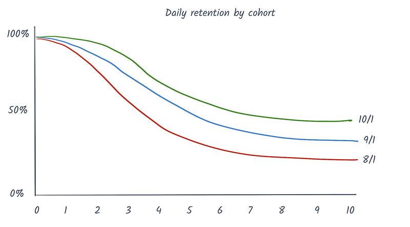
🤔 Does the curve flatten out?
It's said that a flattening retention curve is the most trustworthy sign of product-market fit and in most cases, I agree. Nothing says that people are getting value out of your product like them coming back consistently. If your curve doesn't flatten out at some point, then you are going to have a hard time growing consistently over time.
📈 Where is the elbow of your curve?
This tells you where you lose the majority of your users. This is a reflection of natural usage patterns in your product, but it also helps you pinpoint opportunities to lift retention. Use this point as a heuristic for the time you have to activate users, and do everything you can to demonstrate value before then.
🚀 Where are opportunities for improvement?
The best way that I've found for identifying opportunities is a tactic that I got from Brian Balfour, which is essentially just segmenting like hell. This means splitting up your cohorts so that instead of them being grouped by date range, they are grouped by some characteristic. The possibilities are endless here. Segment by acquisition channel, industry, performed action, performed X actions, performed X actions in Y time — you get the picture.
When you are generating hypotheses for retention and then segmenting you visualization, keep an eye out. If the effect is positive, how can you add more users to this segment? If the effect is negative, how can you remove users from this segment? There's no silver bullet for improving retention in my experience. It just comes down to a lot of analysis and thinking strategically.
Wrapping up
That's it for this post on retention. I hope you found it helpful. I'll be writing more about retention and growth more broadly in the future so stay tuned and follow up with any questions or insights. As always, I'm curious to hear how others are thinking about this stuff, so don't hesitate to reach out.
If you enjoyed this post and you’re feeling generous, perhaps like or retweet the post on Twitter. You can also subscribe in the form below to get future posts like this one straight to your inbox. 🔥